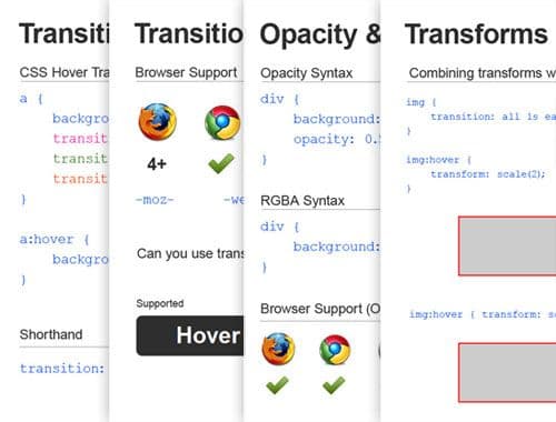
A Presentation about CSS3, Created with CSS3
Earlier on this week I held a training session on CSS3 for my colleagues at Adtrak, focusing on the basics and how we can use it today in our clients’ sites – sites that receive the majority of their traffic from IE browsers (which you probably know don’t like CSS3 oh so much).
I wanted to make my presentation browser based so I could include working examples of certain features of CSS3 that require interactivity, so I put the slides together and animated them using jQuery.
Then I thought – wait a minute, surely I can do this with CSS3 and rid myself of any scripts! So that’s exactly what I did.
I’m going to provide a quick overview of the presentation and finish with a brief explanation of how I put it together (It’s pretty much the same method as the tutorial I posted last week on my responsive sliding image gallery).
The slides…

Overview
Contents
- Intro
- Border Radius
- CSS3 Transitions
- Opacity and RGBA
- Text Shadow and Box Shadow
- Multiple Backgrounds
- 2D Transforms
- Using 2D Transforms with Transitions
- Pseudo Elements
- Linear Gradients
- Radial Gradients
- Selectors
- Take Away
It doesn’t cover everything (it barely touches the surface) and there are a few bits and bobs that aren’t strictly CSS3, namely the selectors, but I felt there were certain selectors that fly a bit under the radar in the mainstream and deserve a bit more coverage.
I do plan on expanding these slides considerably and transforming it into a significant resource for all things CSS3.
How to make a presentation with CSS3
It’s really quite simple. CSS3 takes all the glory but the real star here is simply the :target pseudo-selector, which applies styles to the element whos id is targeted at the end of the URL.
All our slides need an id; I’ve gone for #one, #two, #three etc. And within each slides we need navigation controls to take us to the next or previous slide. I’ve simply styled the controls to be transparent, with the ‘previous’ link taking up the entire left half of the slide and the ‘next’ link taking up the entire right half of the slide.
Obviously the navigation controls for the number #three slide (for example) would have a ‘previous’ link to #two and a ‘next’ link to #four. Like so…
<div class="panel" id="two">
    <a class="back" href="#one"></a>
    <a class="next" href="#three"></a>
</div>

<div class="panel" id="three">
    <a class="back" href="#two"></a>
    <a class="next" href="#four"></a>
</div>

<div class="panel" id="four">
    <a class="back" href="#three"></a>
    <a class="next" href="#five"></a>
</div>
Probably should be a <ul> rather than a list of <div>'s but we won’t get hung up on that right now.
The CSS
Let’s use opacity:0; and stick opacity:1; on the targeted elements. Don’t forget the transition property too!
.panel {
    opacity: 0;
    transition: all 1s ease;
}

.panel:target {
    opacity: 1;
}
You can be a bit more adventurous in terms of the styles and transitions, but in terms of getting the basics up and running, this is really all there is to it!
We now have a list of slides and can seamlessly navigate between them, complete with a nice fade transition!