An Introduction to CSS3 Animation
We’re going to look at the basics of creating keyframe based animation using CSS3, including all of the various properties we can use to control the animation’s behaviour.
Defining the keyframes
As with most animation, CSS3 animation works on a keyframe basis. This removes the limitations we have with CSS transitions, as they only animate from one state to another; for example from a blue normal state to a red hover state. With keyframe animation we can animate from one state to another to another and so on.
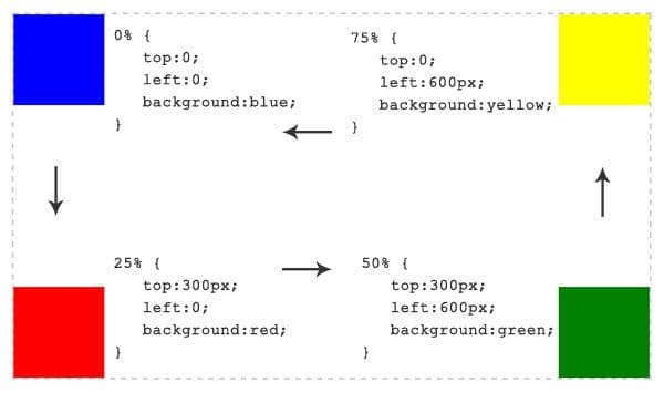
We define when each state change will happen using percentages. Let’s see how this works with an example of a box moving around four corners of a page, changing colours as it travels to each corner.
There are 4 state changes to define, so here’s how we do it...
@keyframes square {

    0% {
        top:0;
        left:0;
        background:blue;
    }

    25% {
        top:300px;
        left:0;
        background:red;
    }

    50% {
        top:300px;
        left:600px;
        background:green;
    }

    75% {
        top:0;
        left:600px;
        background:yellow;
    }

}
In the annotated image below, you can see exactly what each keyframe does.

Applying the Animation to an Element
Now we’ve created a set of keyframes, we need to apply the animation to an element. We do this by simply using the various animation properties on the element(s) we want to animate, like so…
.box {
    /* Your list of animation properties */
}
So what are these animation properties/controls?
animation-name– The name of your animation. Must correspond with name given in@keyframesrule; in this case, ‘square’.animation-duration– How long the animation should last from start to finish. Defined in seconds or milliseconds; e.g.5msor0.5s.animation-timing-function– Describes the varied acceleration of the animation; it denotes where the animation speeds up and slows down over the specified duration of the transition. E.g.easeorlinear. See my previous article for more on the timing-function property.animation-iteration-count– How many times the animation repeats from start to finish. This can be any numerical value or theinfinitekeyword, which loops the animation forever!animation-direction– A value ofnormal(the default value) would play the animation from start to finish. The other value ofalternatewould play the animation forwards then backwards for animations with an iteration count of 2 or more.animation-delay– Only plays the animation after a set amount of time. For example, a value of5swould cause the animation to begin 5 seconds after the page has loaded.animation-play-state– The default value isrunningwhich plays the animation normally; the other keyword ispausedwhich – well, pauses the animation. If you take another look at my demo, I have set theanimation-play-stateproperty to paused when the box is hovered.
This seems like a lot of bytes to simply apply an animation to an element, right? Well, thankfully, we can use the shorthand version to vastly reduce it. The only required property values are animation-name and animation-duration.
.box {
    animation:square 10s infinite;
}

/* To pause the animation when the box is hovered... */
.box:hover {
    animation-play-state:paused;
}
Conclusion
I seem to conclude every one of my posts on CSS3 the same way… with a warning.
It’s understandable that people want to play with new toys, but it must be done with caution, for progressive enhancement and not for vital functionality.
Be subtle and use where appropriate.