Deciding what Responsive Breakpoints to use
Let’s start off by discussing a rather common mindset when it comes to responsive development – it’s the wrong mindset to take on (in my opinion of course) but it seems to be the default thought-process for many. It’s understandable, but we’ll be explaining why in reality, it's not the most logical method.
The Wrong Mindset!
Okay, so let’s pretend we’ve made a nice, fluid layout in CSS, but alas, it starts to break as we drag the edge of our browser window to test. Media Queries to the rescue! But where do we apply these media queries? Right, well there’s the iPhone (amongst other smartphones), the iPad, the Kindle and then your laptops and desktops. With that selection of popular devices that will access your website, it might seem logical to use breakpoints like 320, 480, 600, 768 and 1024.
Have you done this? Yeah, so have I. It’s forgivable. But it goes against what responsive development is all about.
Why?
When you start to think in terms of device dimensions, you’re not thinking responsive. Responsive Web Design is fluid and flexible; something that adapts to the surroundings it happens to inhabit.
Analogy time
Picture a jug of water. Now imagine you’ve got 20 odd cups, all completely different sizes, lined up next to the jug. It doesn’t matter which cup you pour the water into, it will simply adapt to its surroundings and take the shape of the cup.
Wow that was a bad analogy. But you get the gist. Your design needs to adapt and flow into its surroundings and take the shape of the device – whatever that device may be.
So how do you achieve a truly device-agnostic design?
For starters, remove yourself from the device based breakpoints mindset. And get into the design based breakpoints mindset. Make adjustments where the design dictates. Pull your browser window out and see when the design starts to break – that’s your first breakpoint. Use a media query, fix it up and repeat the process. Simple!
Don’t base your breakpoints on devices that are currently popular, base them on your design and where it requires adjustment.
Some gentle contradiction
In theory, we should forget everything we ever knew about currently popular devices when it comes to determining breakpoints, but it’s probably not the wisest move to dismiss them altogether. It’s always important to test your responsive design in as many devices as you can get your hands on, especially the popular ones that will access your website the most. I’m just saying be aware of what’s around at the moment and make sure your site performs as it should.
There are a number of really nicely made, good looking responsive testing sites doing the rounds at the moment and whilst these can be very useful, just be wary of relying on them too much. They encourage device based breakpoints and lack of testing inbetween the devices they display. Additionally, as David Bushell highlighted, most of these testing sites ignore the browser UI on the devices they claim to emulate, pointing out that the iPhone web viewport is not 320×480 when taking this into account.
What’s everyone else doing?
So you know what I think, but what of the big players in the industry? Smashing Magazine is the web design blog and has recently been the subject of a responsive makeover, spearheaded by curly haired Web person Elliot Jay Stocks.
I sent Elliot an email asking for some insight into the breakpoints used in the new site and I was pleased to learn my beliefs were shared by Elliot and were applied in the Smashing re-design project…
“I strongly agree with you that breakpoints should be defined by ‘when it looks appropriate’ rather than conforming to device dimensions, which date very, very quickly. For SM, we certainly applied this logic…”
There you go; someone significant agrees with me! Anyway, I did some firebugging and went through their CSS to identify exactly what breakpoints they used…
Smashing Magazine Breakpoints
0 and Up (Screenshot is at 320px)

The fluidity of the layout does all of the work to start with right up until the first breakpoint.
500px

The first breakpoint is used for the tiniest of fixes; it simply says that when the viewport is below 500px, change the search button text from ‘Search’ to ‘Go!’ as this text obviously scales down further.
610px
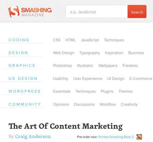
The first major breakpoint isn’t until the viewport reaches 610px, so the fluid framework of the site handles everything below that, which is pretty good going. The navigation explodes from it’s dropdown menu into a rather large set of lists. These changes definitely feel like the transition from mobile to tablet.
650px
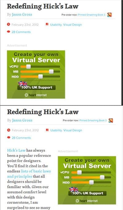
Okay, this is a really insignificant breakpoint in the grand scheme of things, but I’ve included it to highlight that it’s okay to use media queries for minor things that just need fixing; they don’t just have to be for major changes. This particular breakpoint states that when the viewport is wider than 650px, then float the advert to the right (the one visible in the shots above).
800px

Here we see more big changes with this breakpoint. A second column is brought in to accomodate the secondary navigation that was previously taking up large amounts of space above the content.
1020px

Here we see more big changes with this breakpoint. A second column is brought in to accomodate the secondary navigation that was previously taking up large amounts of space above the content.
1220px

Now for the first time, we have a 3 column layout, with the secondary nav returning to the left hand-side, but this time, the right hand sidebar is maintained.
1450px

The final major breakpoint adjusts the design for widescreen monitors. A further fourth column is introduced as the top level navigation shifts to the left hand side of the page next to the secondary nav.
There were two more breakpoints used at 1600px and 1800px, but these were only very minor fixes in areas such as the footer.
Summing Up
So there you have it. A set of breakpoints which bare very little relation to any currently popular devices, because they’ve been added where the design suggests they should be, not where devices suggest they should be.
I’ve used Smashing Magazine as a case study as it perfectly backs up my point, but I looked at a few more responsive designs and found that they’d clearly based their breakpoints around device dimensions. These sites included sony.com and 24ways.org; pretty big players in their own rights, so don’t feel too disheartened if you’ve fallen into the same trap as it seems the very best of us have.
Disagree with my thoughts? Go leave a comment below and we’ll have it out!