Famous Logos in CSS3 – Pepsi
This is the first in a new, experimental CSS3 series within which I will be attempting to re-create a famous brand logo each week without the aid of any images, using only CSS.
I should probably start by saying there may be better or more efficient ways to achieve my outcomes than whatever methods I choose over the coming weeks – and if you can think of one, I’d love to see it in the comments section!
We’re going to kick things off with the Pepsi logo. Not overly complicated and doesn’t have any shadows, highlights or any other details that require special attention. Just simple block colours – a nice place to start things off I feel.
So here it is…
Browser Support
Browser support for CSS3 is getting better with every release, but for some of the new properties, browsers still rely on vendor specific pre-fixes in order to render them correctly.

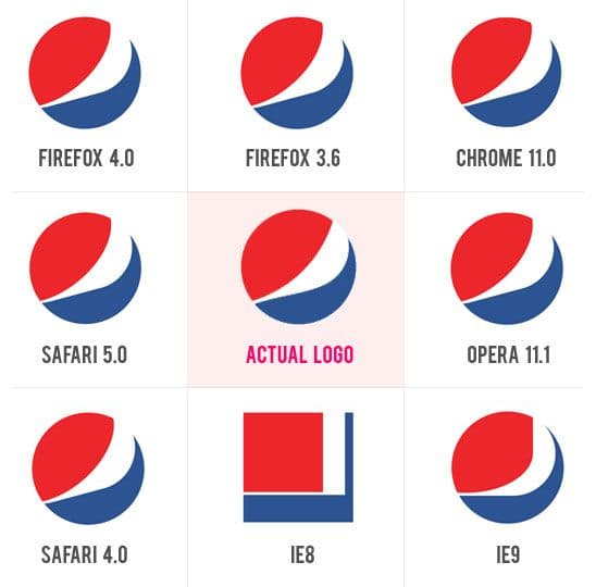
In this case, the most recent release of most of the major browsers passed with flying colours, as well as some of the previous versions too. However Chrome lets us down slightly and IE9 even more so.
Issues with Chrome and Internet Explorer
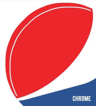
Whilst Chrome supports the CSS3 transform property, it seems to cause rotated elements to have jagged edges, which although aren’t instantly noticeable in this case, do detract from the outcome on closer inspection, as you can see from the images below.


I’ve added white guidelines to try and show more clearly the roughness of the Chrome outline compared to the smooth curve when rendered in Firefox.
IE9 simply does not appear to support the transform function, resulting in the red and white areas of the logo positioning themselves horizontally rather than at an angle.
IE8 failed miserably of course, with virtually non-existent CSS3 support, including the most vital property in this case; border-radius, resulting in square blocks of colour that don’t exactly resemble the Pepsi logo.
As for my performance, I think my outcome is very near to the real thing and at first glance looks right on the money. However if you apply your focus to the top right corner of the red area you will notice that it just curls to the left a little too much when compared with the real thing. Overall though I’m very pleased with the result and feel it’s a good start to what will hopefully be an interesting series of posts.
The CSS
We’re not going to dissect the code in great detail, but we are going to look at the important properties that have allowed me to transform some simple shapes into something that resembles the Pepsi logo.
Border Radius
First of all we have the border-radius property which is already very widely used in the industry as an easier method of creating rounded boxes. The properties full extent however, does not seem to have the same mainstream knowledge.
By this I mean the ability to create elliptical borders using border-radius. To achieve this we simply use two values instead of one; one for horizontal and one for vertical. The syntax differs slightly between the vendor prefixes so be careful when using this technique.
-moz-border-radius:500px / 300px;
-webkit-border-radius:500px 300px;
border-radius:500px / 300px;
Transform
The transform property allows us to manipulate elements with rotation. Before I made use of this property, my result was as shown below.

Now this doesn’t look awful – but it’s not perfect. To make it [almost] perfect, we simply need to rotate the white and red areas slightly anti-clockwise in order for the shapes to resemble the Pepsi logo. Again, remember the vendor specific prefixes!
-webkit-transform:rotate(-15deg);
-moz-transform:rotate(-15deg);
-o-transform:rotate(-15deg);
transform:rotate(-15deg);
So there we have it. Two simple CSS3 properties with the help of standard CSS can produce the Pepsi logo with relative ease. I hope you enjoyed this and are looking forward to my attempts in the coming weeks! If you have a better way of doing this, or have a logo request for future weeks, please feel free to leave a comment below.
Finally, here is the final CSS3 Pepsi logo.